Someone has asked me to cast some type to fill out a font they already have. For reasons unknown, he has almost no capital S and is also short on capital C and T. He mailed me a sample type of each to ensure that the new type I cast would match the alignment of his existing type. Although there is a standard alignment for most fonts, this is not always followed and it is essential for new type to duplicate the alignment of the old type it will be mixed with, even if this alignment is non-standard.
As a preliminary to doing this casting work, I sat down for a few minutes to measure the size of the samples he had sent—something else I should also match. The result is this absolutely riveting video of me sitting at a table with a micrometer and slide rule. The video has been sped up at times where I have nothing to say about the process.
I found to my surprise that the type was cast 1 to 2 points narrower that the standard size. According to the markings on the matrices, they should have been 11, 10.5, and 11 points (0.1521″, 0.1452″, and 0.1521″) but were instead 0.1315″, 0.1187″, and 0.1422″ for the S, C, and T respectively. The faces of the type overhung to such an extent that the combinations “CT” and “ST” could not be set without a copper or brass space between the letters, or perhaps filing off some of the beard on the overhang.
The face in question is 18 point Swing Bold (Lanston Monotype #217). This is a script-style face with the lowercase letters all joining to each other as an imitation of handwritten text. The capital letters don’t join to the lowercase, though. The face also includes a lead-in stroke to use at the start of lowercase words to clean up what would otherwise be an abrupt start to the stroke (where it would normally join the previous letter). The specimen pages don’t show these lead-in strokes in use, though. Although they provide nice finish to the words, they can’t be used before the second letter of a capitalized word. Doing so would generate too much visual space between the capital and next letters. Perhaps these narrow-cast capitals are intended to be used with the lead-in stroke.
The following examples are approximations made from a scan from the specimen page for this face. The crowding of the S does not necessarily correspond to the width reduction of the type samples I have, but this shows the general effect.
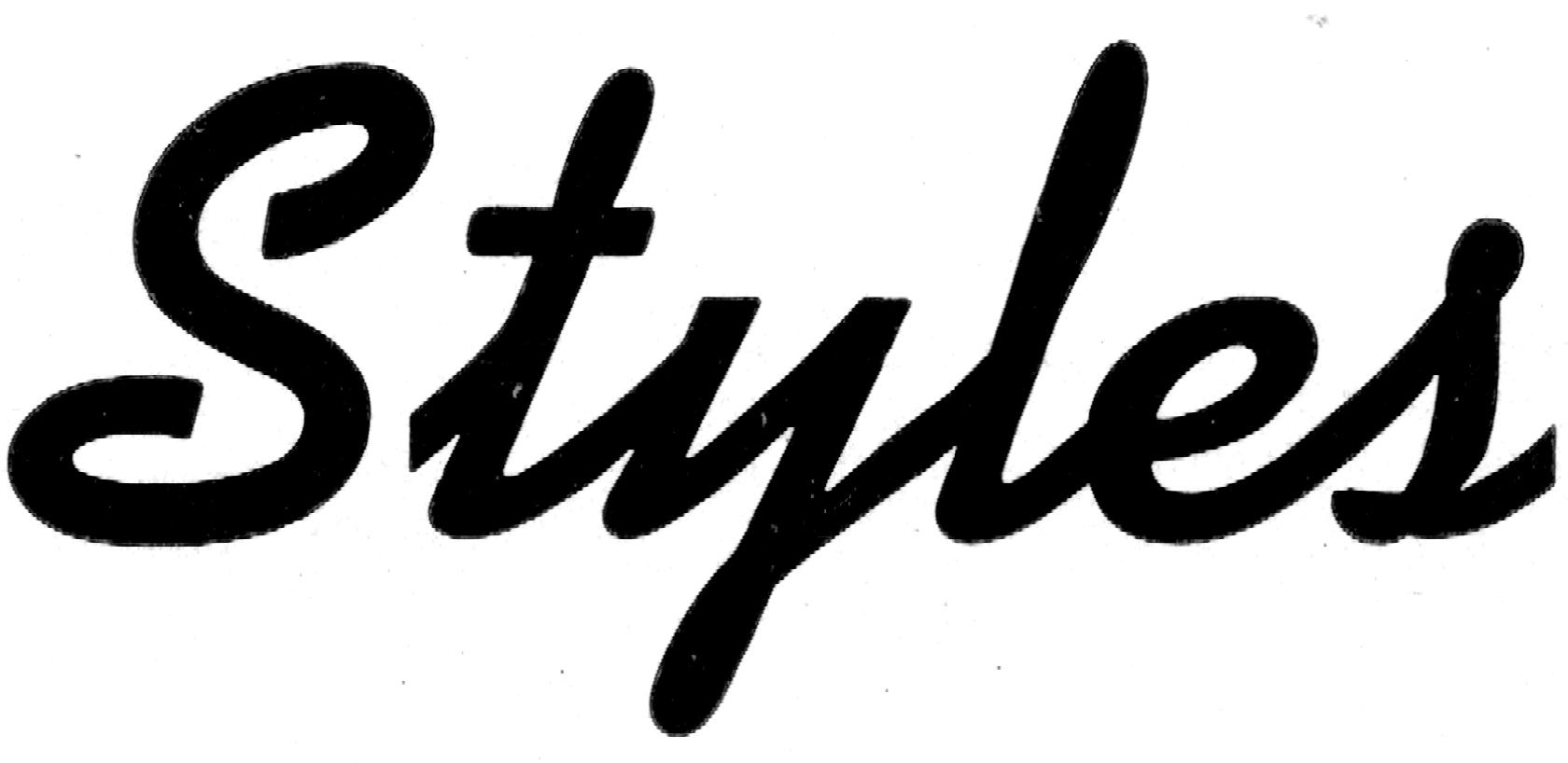
This is a word taken from the text sample on the specimen page. Note how the lowercase letters join, but the start of the t is rather abrupt since it is right at the edge of the type body.
This is the effect you would get with the S cast narrow, so it can be closer to the t. Although some of the space is gone, there is still a rough transition from the S to the t.

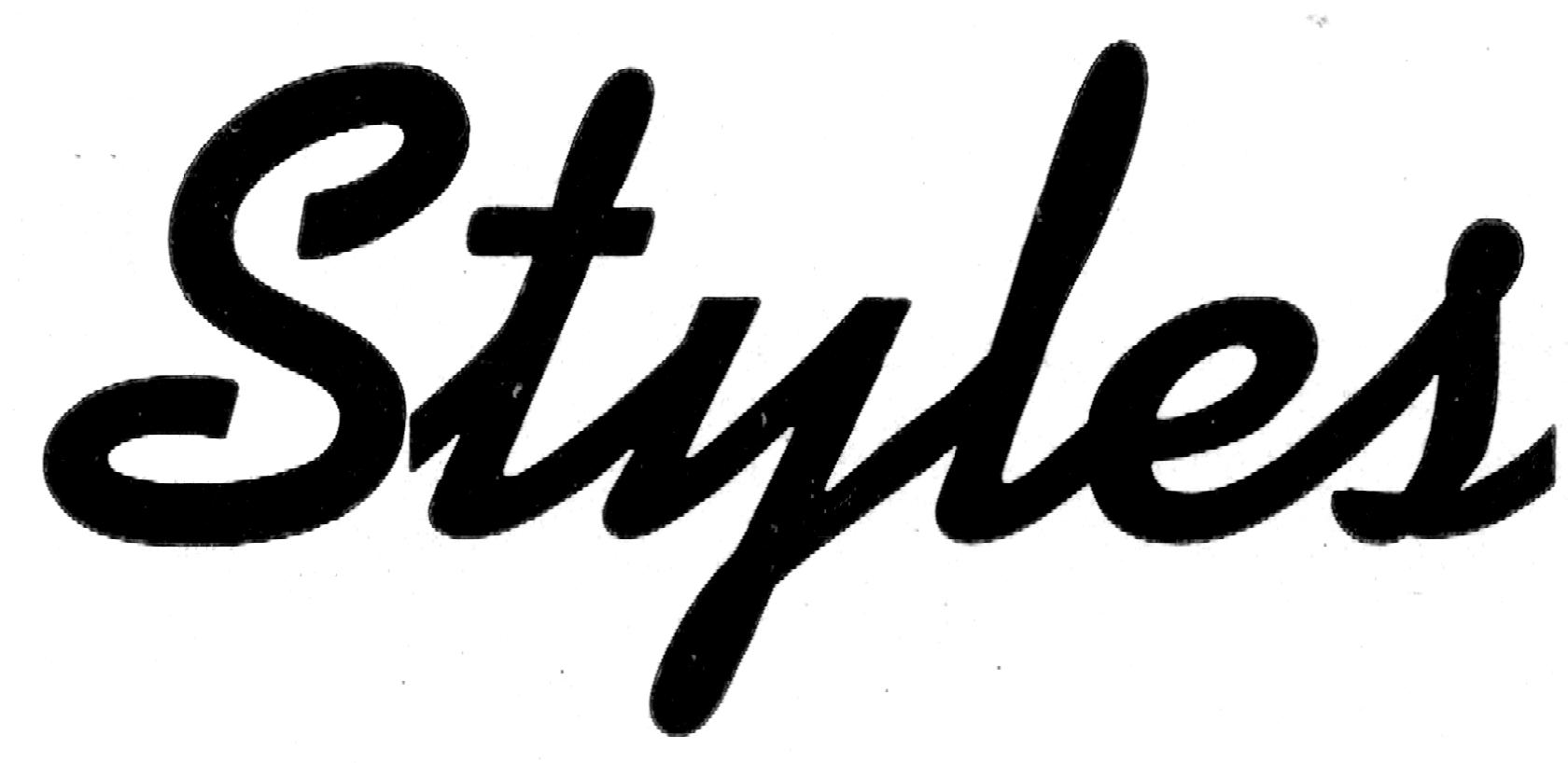
This is what the word would look like if the lead-in stroke were added to the t and using a normal-width S. The start of the stroke looks much better, but the large space between the S and t make this look like two words (what is an “s tyle”?).
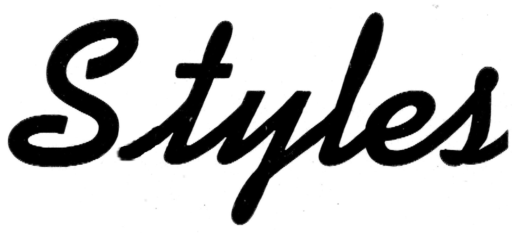
This is a combination of using the lead-in stroke and a narrow-cast S.
Whatever the reason these are cast narrow, I’ll have to verify that it wasn’t just a fluke that the samples I received were some rare narrow-cast letters from a case of otherwise standard width ones.
Leave a Reply