
I have a short project in the works, and since I don’t have a Monotype Keyboard or a computer interface for the caster, I have to fall back to hand setting some text. I have a few paragraphs that I want to set in 12 point Binny Old Style. I had some of this in my case that I had cast when I was first getting some experience with font casting, and due to some stupidity between then and now, the case had mixed alignments on the type. My first casting had been at the wrong vertical position on the type body, then I had cast more with the correct position. At some point I mixed these, probably from distributing some set text into the wrong case. But because the case was now mixed, any type I try to set ends up with dancing letters, and there are not enough of either alignment to do this project (not to mention separating them would be a nuisance).
So this evening I dumped all this type into my Monotype hellbox, and cast a fresh, properly aligned font based on the letter count of my project. There is a utility at Ian Schaefer’s web site for doing this counting. I printed off the count sheet for the project, wrote the matcase positions on the printout, and started casting. I would set the matcase position manually, and count pump strokes in my head, usually casting 10-20% more than the printout indicated. I also cast plenty of spacing. All through this I was also estimating when there was a full line on the galley so I could manually trip the galley cycle. Sometimes the line was a bit long so I would pull the extra types and set them aside, and use them later to fill slightly short lines.
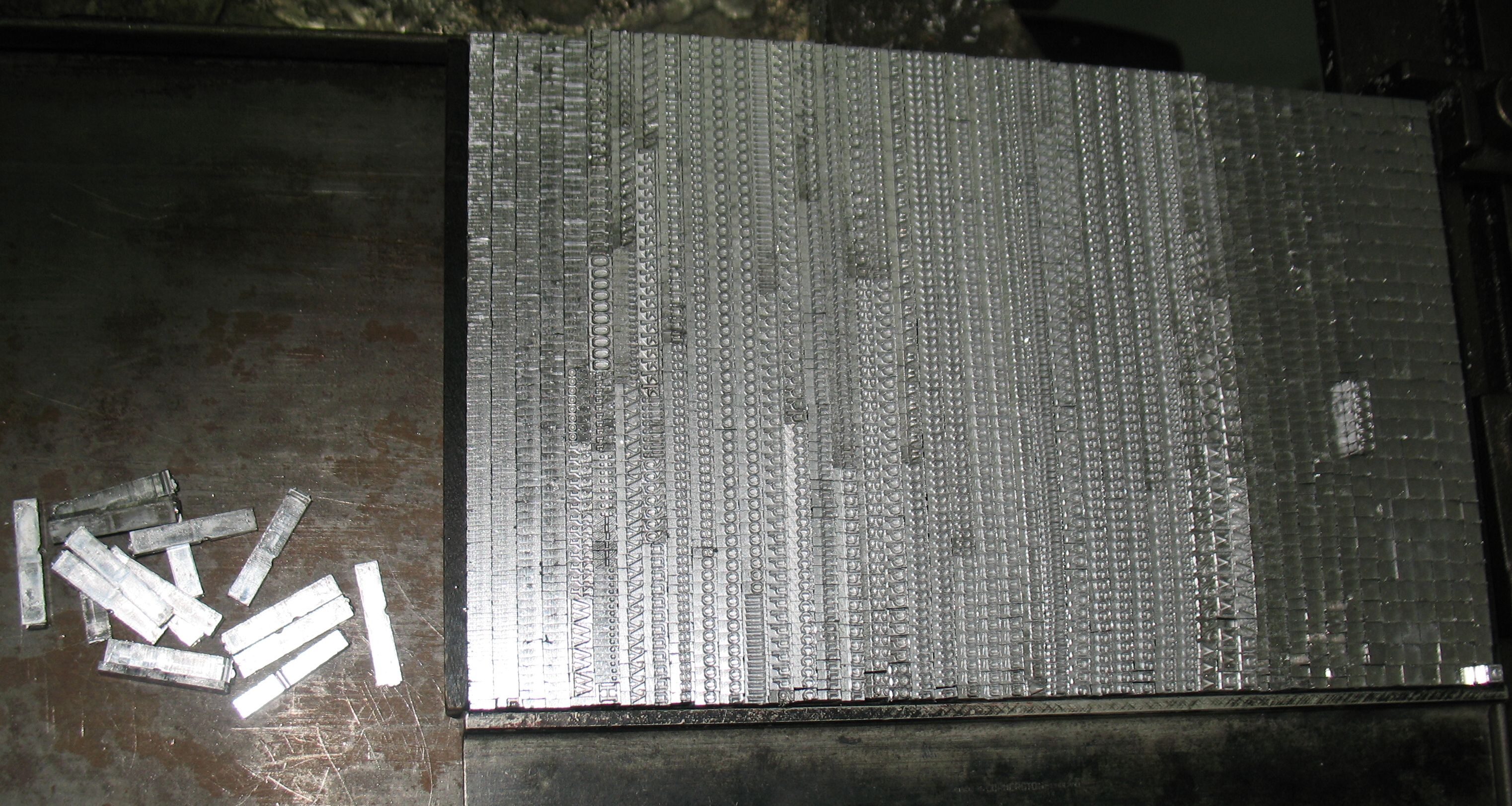
The cast type on the galley before coming off the caster. The loose pieces on the left are pulled from lines that were too long.
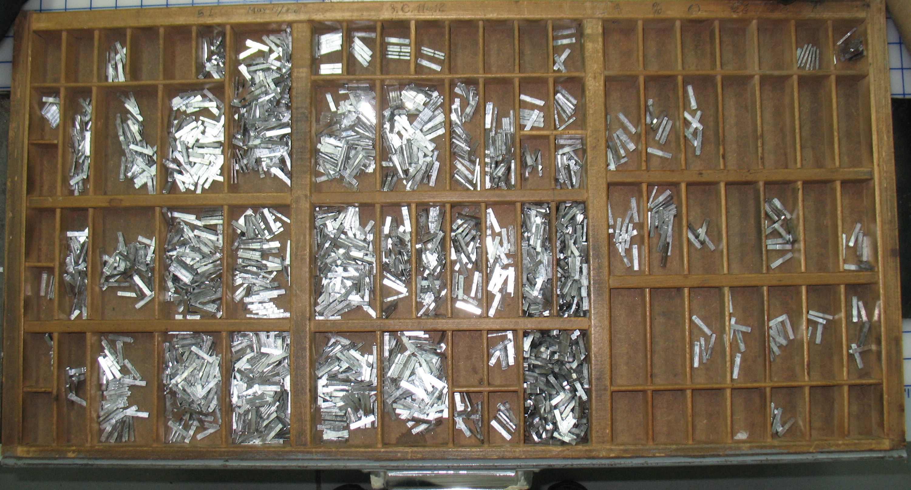
The new type distributed into a typecase. Some of the compartments are empty because the text I will be setting did not need those letters or figures. Upper right contains the fractions ½ and ¼, and upper left contains a small superscript o so I can use “Nº” instead of “#” which was not in the matcase.
My counts called for an exclamation mark, but for some reason there were none in the matcase, so I might have to either steal one from another 12-point font or live without.
I will also have to remember that this is cast with a soft Linotype alloy, so I should not expect it to be as durable as it would be with a harder alloy.
This was cast using a 12-point American 3E composition mould, and I had very little trouble with the actual casting. A few of the very narrow characters started getting bleeding feet (something which I would expect more from the wide types) after casting 30 or 40 of them. What with all the time spent setting the matcase position this intermittent casting did not seem to need any cooling water for the mould, although using water might have prevented the bleeding feet.
Leave a Reply