Last week was March Break, and Audrey and Lily flew to Calgary to visit Granny. I took the opportunity to do a few home improvement projects (replacing a bathroom sink, putting up a knife holder in the kitchen, and installing some under-cabinet lights).
I also spent what seemed to be an inordinate amount of time getting my contribution ready for the Grimsby Wayzgoose Anthology. The work was a single sheet that combined laser printing and letterpress. It took me two tries to get the laser printing (photocopying, actually) to come out straight on the sheet. It seems that the copier I was using was not quite able to feed the special paper straight so each new generation of copy was canted a bit more.
As for the letterpress work, I first tried setting it in the Binny Old Style 12 that I had in my typecase, but found that there were mixed alignments, so I dumped all that type and cast fresh.
When I went to set the colophon in Times Roman 10, I found that I did not have enough 10-point quads for all the short lines involved. So I fired up the caster again and cast a pile of em and en quads in 10 point.
I did not have a # sign in the Binny Old Style (to mention a face name, Modern #2), but I had a small superscript o (º) with which I intended to set “Nº 2” instead. I found I had no capital N’s (the original copy contained none so I had cast none) so I had to cast a few of those.
I did not have a / in Times Roman for a URL in the colophon, so I cast an 8-point / on a 10-point body (to match the rest of the type in the line) and fiddled the alignment and body width so it would look right.
All told, during the week, I think there was only one day that I did not have to fire up the caster for something.
The printing was to be done on my 7×11 C&P on 8.5×11″ paper to be folded in half to make a 4-page section for the Anthology. This C&P cannot normally be used to print a whole side of 8.5×11″ paper. With 1″ margins the type will fit the chase, but the lay pins would have to be below the bottom edge of the platen to position the printing on the sheet properly. Fortunately, none of the letterpress work had to be very near one edge of the sheet so I was able to do the job in just two runs through the press.
One of the chases I used was a bit sprung and needed shimming to make the type run straight across.
The paper I had chosen, some 120 gsm glossy stock that we had as scrap, turned out to be not so great for letterpress work. It did not take the ink as well as I would have liked, so close examination of the printing shows a bit of a stippling as the ink film split between the paper and type. Reducing the amount of inking helped a bit but then impression was touchier to adjust. I wanted kiss impression because the thin glossy paper would just end up embossed on the reverse by heavy impression.
Because of the poor absorption I also had to interleave all the sheets to prevent offset. It took me quite a while to get the right rhythm to feed the press and interleave the sheets as I removed them.
I used an oil-based ink, so it was dry enough after 12 hours to print the second side. Another 12 hours to dry and it was time to fold the sheets and number the copies. Even as I was bundling the copies to send to Grimsby for binding, I noticed some copies with ink smudges. I had to replace these out of a few spare copies and number them to match the smudged ones.
Altogether, starting with 150 sheets of paper, I ended up with 128 keepers (125 numbered and 3 artist’s proofs) and perhaps 5 more good copies which I will deface now that I don’t need any more spares. All the bad copies do not, however, go completely to waste. They end up in a bin which I draw on when I want to take a test print or want to run junk paper to clean up the ink when I’m done and it is time to clean the press. There are also 150 sheets from the first round of misaligned photocopying; all the text is on one half the sheet so I will cut them down and keep the smaller sheets for some future project.
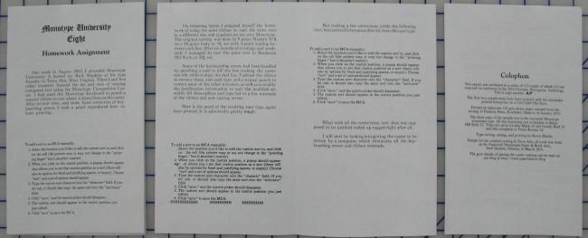
This is the finished job. It is deliberately a low-quality photo; I will post a readable image after the Anthology is published. The bottom sections of the two first pages are laser printed.
A good image of the Anthology contribution can be found at the Wayzgoose postmortem post.